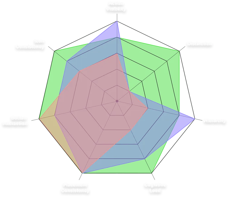
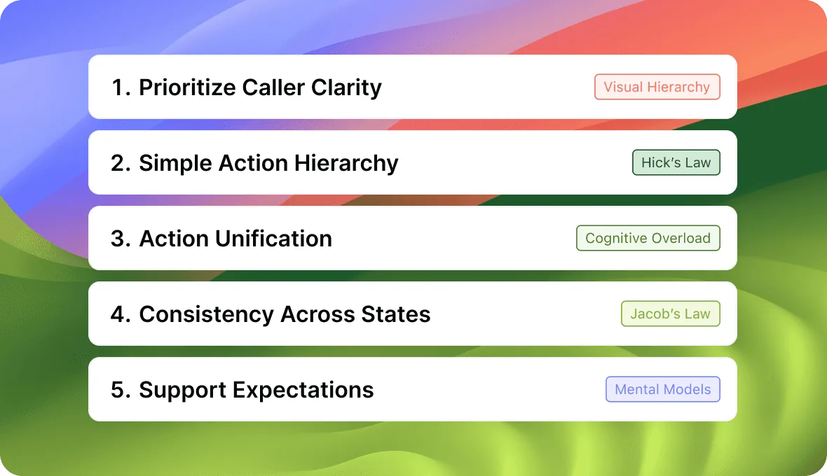
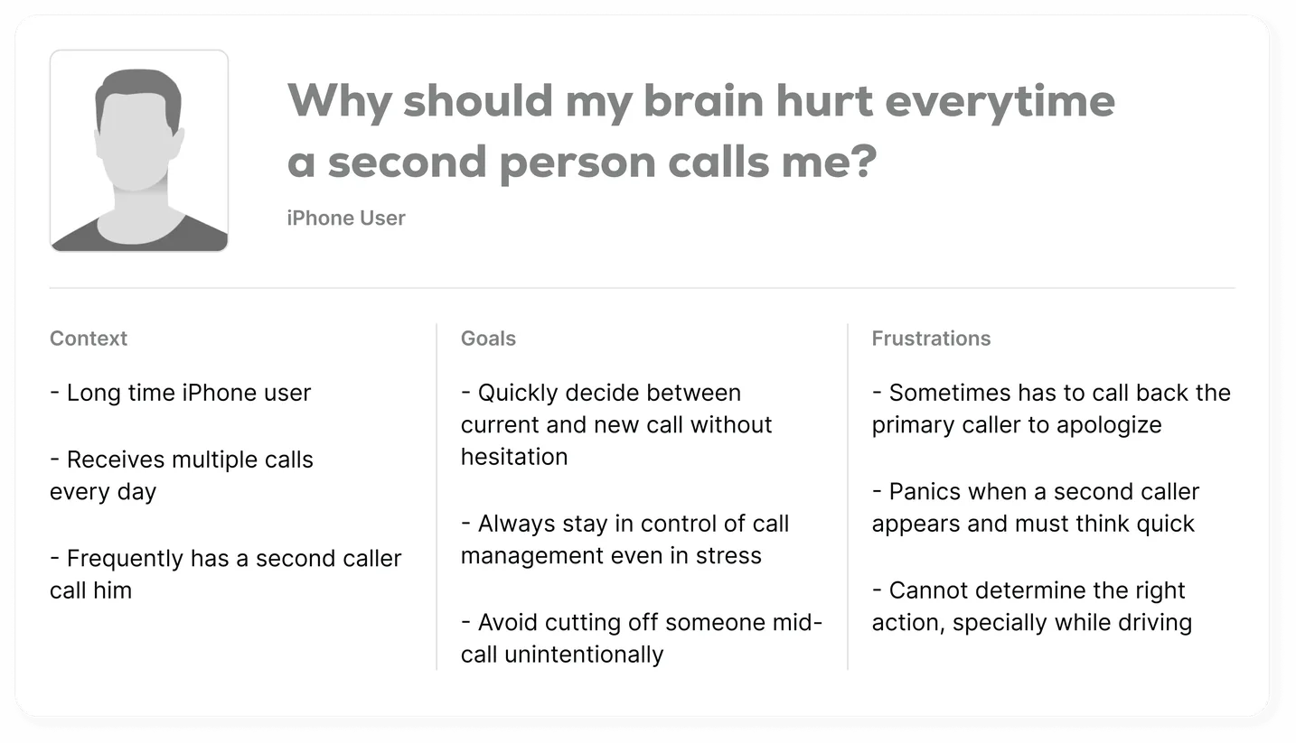
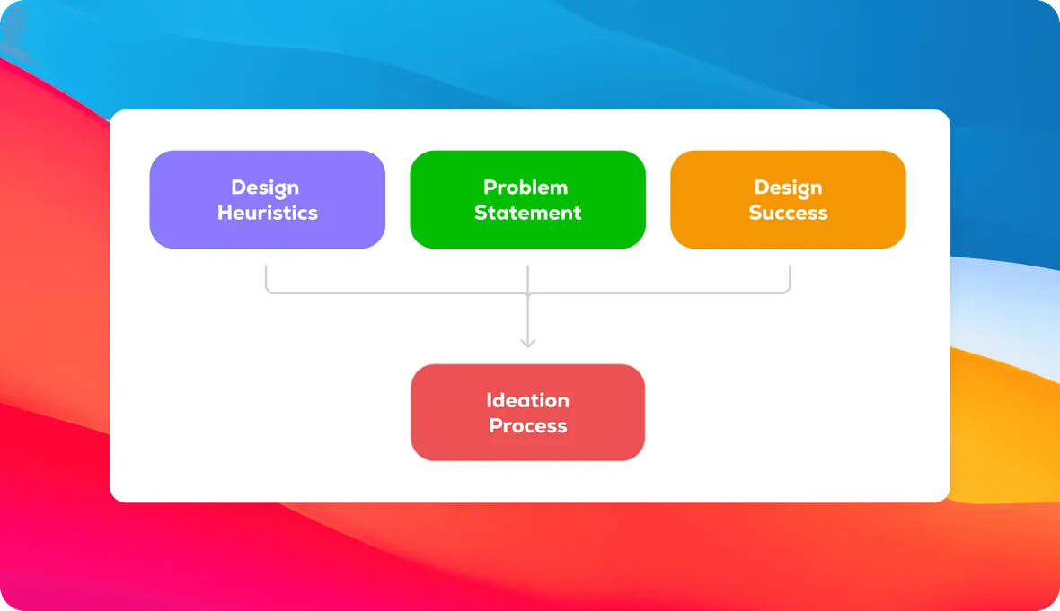
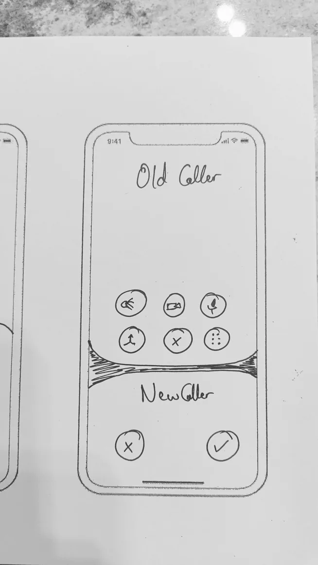
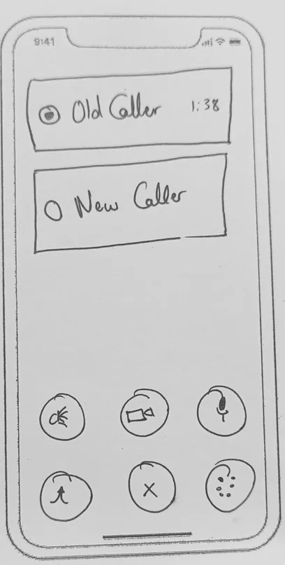
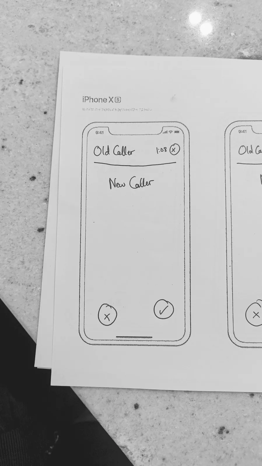
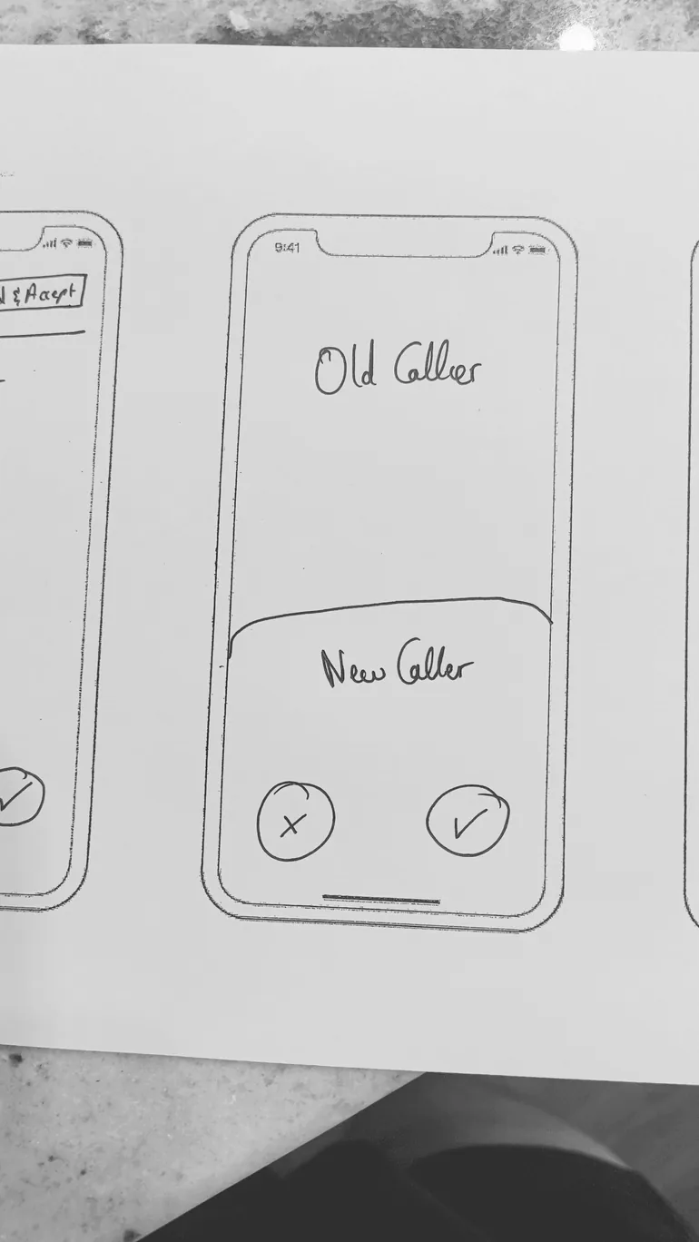
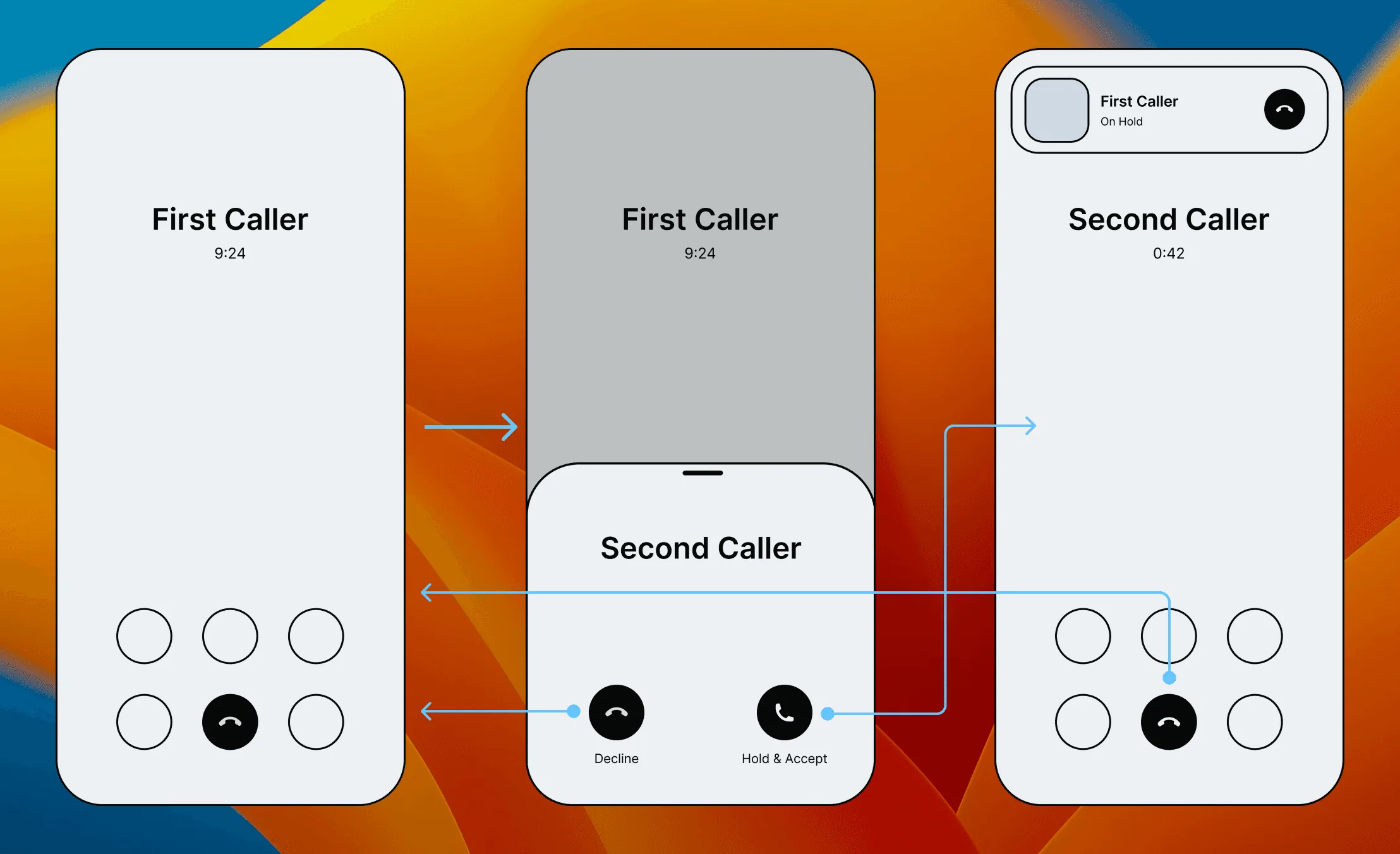
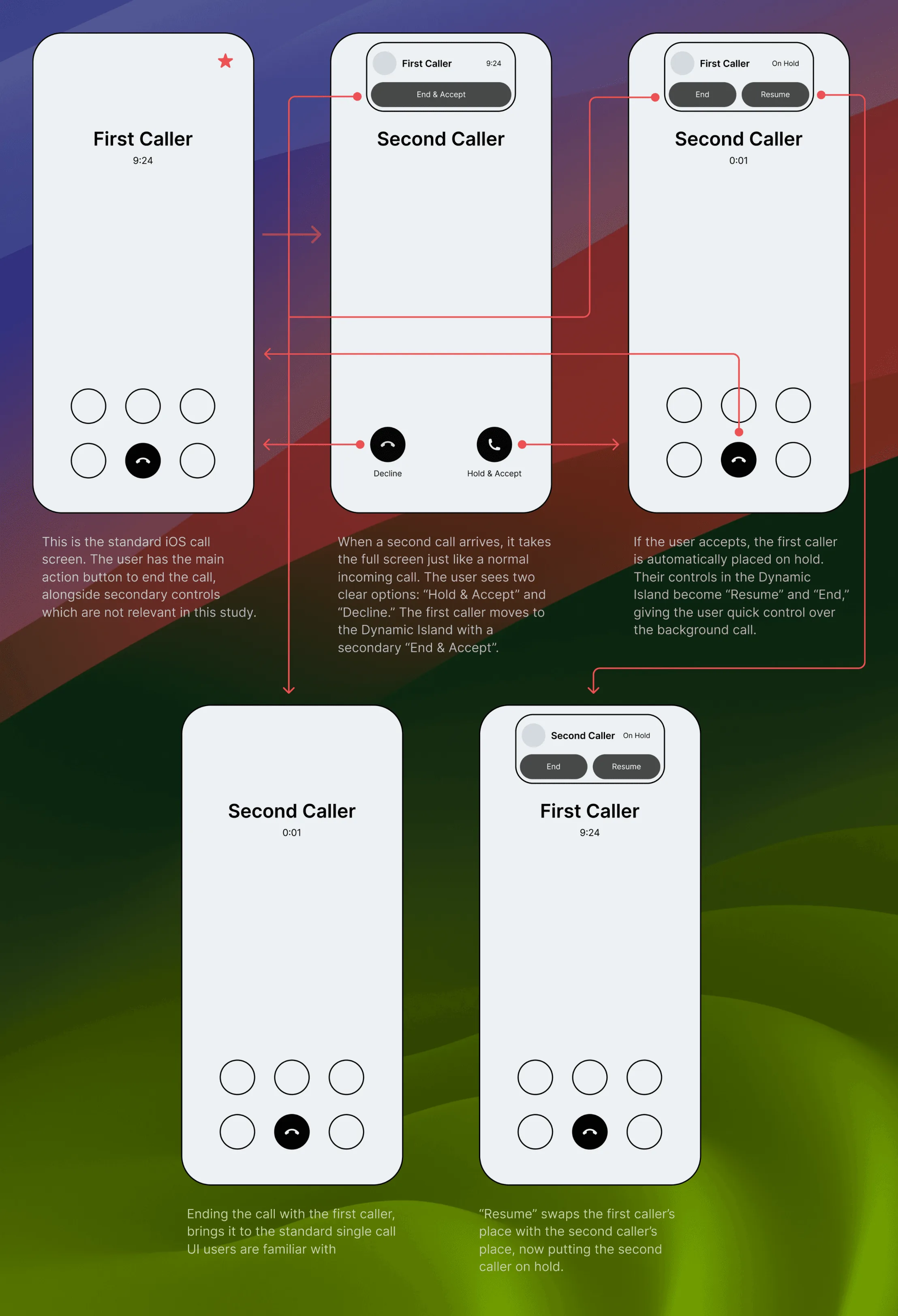
After careful consideration and revision of the lofi wireframes, we came to the conclusion that the second option provided more value to our users, and targeted each and every one of the design heuristics, and took into consideration the problem statement
To kick off the UI, we used our own Figma UI Kit, to keep everything consistent with the Apple language, and to have a swift transition into development. Although our UI Kit provides the guidelines and the atomic components, we had to create case-specific components to show visually what the solution components are, and to prototype to as real-life as possible with Figma.